
Screen Language #4+5
Buttons and Screen Actions
Today's tutorial is slightly different. I've chosen the topic of buttons and screen actions, which provide a way of interacting with screens. However, there is a lot to talk about. So much in fact, that I've decided to make this into a double tutorial, combining #4 and #5.
This way, there is a middle point where you can rest and revise, but it doesn't completely separate related topics.
- Screen Language #4 - textbutton, button and imagebutton statements, screen action (Notify) on click
- Screen Language #5 - Screen Actions on hover/unhover, mousearea statement, more screen actions examples (Call, Show/Hide, SetVariable).

Screen Language #4
textbutton, button and imagebutton statements, screen action (Notify) on click
Buttons are a way for players to interact with a screen. There are three different statements that create a button: button, textbutton and imagebutton. We're going to talk about the textbutton statement first - I'd consider that one the simplest.
textbutton combines the button and text statements to create a text on screen, just like the text statement alone would, that lets us add properties of buttons. We're going to start out with just a single one: action.
screen ourScreen():
textbutton "Click me, I do stuff!":
align (0.5, 0.5)
action NullAction()Ingame it looks like an ordinary text. Even though it says it does stuff, it doesn't yet. First, we have to go through some theory.
Buttons can only be interacted with if they have the action property. The action property itself defines what happens when the button is clicked.
It's value has to be a Screen Action.
Screen Actions are used by statements that players can interact with, to determine what happens when they do. With parentheses required at the end, they look like functions, however, they are not functions.
The screen action that I've used in the code above is called NullAction. This screen action does nothing, but using it is different from omitting the action property completely. It makes the button interactable - For example, the text now reacts to us touching it with our cursor.
I'll now introduce you to a second screen action. It is called Notify.
Notify is a screen action that makes the notify screen appear, with a given message, which stays for a tiny bit before fading away. It is a very simple screen action, ideal for demonstrations and any sort of testing.
screen ourScreen():
textbutton "Click me, I do stuff!":
align (0.5, 0.5)
action Notify("See? I told you I do stuff.")With the Notify screen action provided to the action property of our textbutton, the button will now react when we click it, as it should.
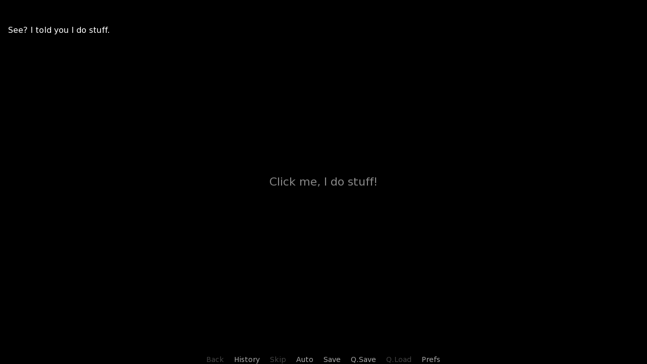
The textbutton statement, as I've already mentioned, is a combination of two other statements, button and text.
Let's look more closely at that, by recreating the code above using the button statement.
define white = Solid("fff")
screen ourScreen():
button:
background white
xysize (450, 300)
align (0.5, 0.5)
action Notify("See? I told you I do stuff.")
text "Click me, I do stuff!":
size 36
color "08a"
align (0.5, 0.5)button is very similar to the frame statement which we encountered back in Screen Language #3. Just like frame, it has a background and padding by default. Padding doesn't concern us, since we're setting a fixed xysize anyway, and I defined a white Solid displayable to use as the button's background.
It is worth mentioning however, that often a button can have background None, creating a transparent area that reacts to clicks.
Inside, we put a text with the same message like the textbutton had. I also added size and color to make it fancy, and aligned it to the center of the button.
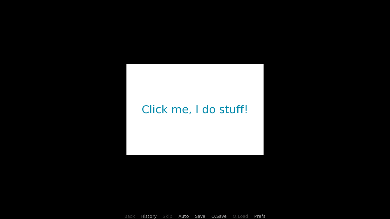
The great thing about button statements is that you can put multiple statements under it: images with add, multiple texts, frame or two, it will all be a button that acts the same.
But of course, right now it's not a perfect recreation of the second code block. This is because the textbutton statement, unlike the button, has no background nor padding by default.
textbutton, however, can still take these properties, allowing us to manually add the background, change it's size, and end up with the same result as the button statement alone yielded.
define white = Solid("fff")
screen ourScreen():
textbutton "Click me, I do stuff!":
background white
xysize (450, 300)
align (0.5, 0.5)
text_size 36
text_color "08a"
text_align (1.0, 0.5)
action Notify("See? I told you I do stuff.")As far as the text properties go, we can get to those by using the prefix text_. And it's not just for text properties like size or color, it's for other properties, too - Like for the text_align from the positional properties.
At the end, there's the action again, with the Notify screen action.
Finally, let's look at the imagebutton statement. Just like textbutton shows text, imagebutton shows displayables or images.
With it, we'll learn two new properties, quite crucial ones: idle and hover.
define darker = Solid("72619c")
define brighter = Solid("c6bfd7")
screen ourScreen():
imagebutton:
xysize (300, 300)
align (0.5, 0.5)
idle darker
hover brighter
action Notify("Taste the power of an imagebutton!")To understand idle and hover, you need to understand button states (Theory time!). There are five different states that the button can be in:
- insensitive
- idle
- hover
- selected_idle
- selected_hover
We've mentioned insensitive at the beginning of this tutorial - It's when the button cannot be interacted with.
idle is the state when the button is not hovered (i.e. the cursor is not touching it).
hover is the state when the button is hovered.
selected_idle and selected_hover are just like their regular idle and hover, but, as their prefix suggests, they're used when the button is selected.
The imagebutton statement straight up has these states as properties. idle is the image or displayable used when the button is in the idle state - which has to be provided, by the way - and hover is the image or displayable used when the button is in the hover state. Same with their selected_ counterparts.
Theory over. For idle, I've defined a darker image, a Solid displayable. Same for hover, just a brighter color.
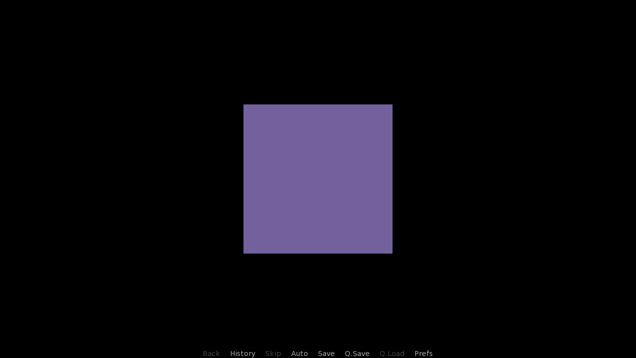
This creates a button in the form of an image, an image that's changed based on the button state. It still has our familiar Notify screen action, so clicking on it will still bring up the notification.
Finally, while not utilized here, I want to mention that you can also use all button states as prefixes for properties, too. For example, the regular button can have properties like idle_background and hover_background to have it's background change depending on it's state. These can even be used by non-button statements which are inside a button, like hover_color for a text, or selected_idle_spacing for a vbox.
Here is where the Screen Language #4 ends. Let's take a look at what we have learned so far:
- Using the textbutton statement
- What Screen Actions are
- What the NullAction and Notify screen actions do
- How the button statement takes window properties, just like the frame statement
- How to style the textbutton with the text_ prefix
- What button states are there
- Using the imagebutton statement with idle and hover properties
- That you can use button states as property prefixes
Breathe, stretch and go grab a glass of water. This must've been a lot to take in. Take it slow, revise, study the code, and when you're ready, continue to Screen Language #5 below.

Screen Language #5
Screen actions on hover/unhover, mousearea statement, more screen actions (Show/Hide, Call and SetVariable)
We already what screen actions are, what buttons are and that they take the action property to do a thing when the button's clicked.
Let's now talk about two more properties, hovered and unhovered, which also take a screen action.
define darker = Solid("72619c")
define brighter = Solid("c6bfd7")
screen ourScreen():
imagebutton:
xysize (300, 300)
align (0.5, 0.5)
idle darker
hover brighter
action NullAction()
hovered Notify("Stop touching me!")
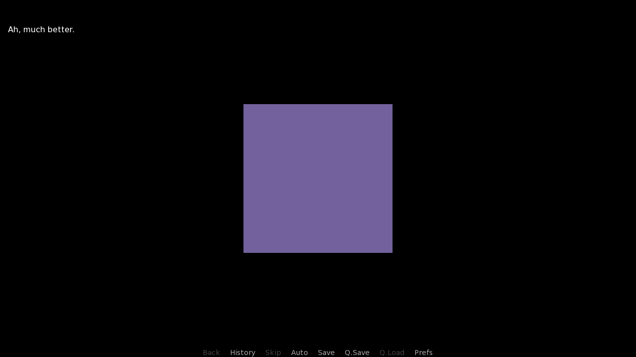
unhovered Notify("Ah, much better.")While the the screen action on the action property activates when the button is clicked, hovered activates when the button becomes hovered, and unhovered activates when it goes back to being idle. Remember button states?
For both hovered and unhovered, I've put two new Notify screen actions. I've also changed the action back to NullAction, so that clicking on it will now not do anything.
But remember, without an action property, the button is insensitive, and the hovered and unhovered can never be triggered.
With this code, hovering over the button will cause the first Notify message to appear...

…and putting the cursor away again will cause the second Notify message to appear.
For the last statement of today I'd like to mention the mousearea statement. It's sole purpose is being the more efficient brother of the button statement when used in situations like the one above.
It doesn't take the background property, so it will always be a transparent area. It doesn't take the action property either, so clicking on it does nothing, but unlike in a button statement, the mousearea can still be interacted with even without the action property - It's there to trigger hovered and unhovered only.
screen ourScreen():
mousearea:
xysize (300, 300)
align (0.5, 0.5)
hovered Notify("Stop touching me!")
unhovered Notify("Ah, much better.")The area of effect is still the same, a 300x300 square in the center of the screen. It still triggeres hovered and unhovered, just like the button did.
Talk about statements is over. For the final part of this tutorial, I'd like to show you more screen actions. I want to show you four of the most common ones, but you can find all of them in the Ren'Py documentation - so don't be afraid to experiment with them after we're done here.
The first example includes not one, but two new screen actions. Not only that, I believe it is also the first code block we've seen with two different screens defined!
define darker = Solid("72619c")
define brighter = Solid("c6bfd7")
screen ourScreen():
imagebutton:
xysize (300, 300)
align (0.5, 0.5)
idle darker
hover brighter
action Show("alsoOurScreen")
screen alsoOurScreen():
textbutton "Can you click me? I'm a little shy.":
xalign 0.5
text_size 42
action Hide("alsoOurScreen")Of course you can have many different screens defined at the same time. Ren'Py has a ton of screens by default, like the main menu, the save, load and preferences screens, even the dialogue box is a screen.
And while we haven't mentioned it yet, you can, of course, have multiple screens visible at the same time. There are two ways how to achieve that: Through the use statement (Which we'll probably talk about in the future), or through Showing it - either through the Show screen action, or through a Ren'Py function. Here, we're using the former.
On the first screen, there is our familiar purple imagebutton. Once we click it, the Show screen action is run, and the other screen, called alsoOurScreen, is Shown.
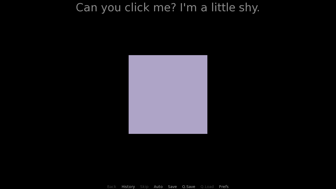
alsoOurScreen consists of just a single textbutton - One that says that the new screen is shy, and would like to be hidden. We can achieve that by clicking the textbutton that uses the Hide screen action.
Having multiple screens shown at the same time is a very common practice, and implementing it is quite simple, as you can see.
Third screen action that I want to mention is named Call. The Call screen action is used to call a provided label - Immediately exit the screen and enter it.
define darker = Solid("72619c")
define brighter = Solid("c6bfd7")
screen ourScreen():
imagebutton:
xysize (300, 300)
align (0.5, 0.5)
idle darker
hover brighter
action Call("ourLabel")
label ourLabel():
"Lezalith" "This is the only message you're going to get."
returnOnce again, our familiar imagebutton. Once clicked, the Call screen action is triggered. We exit the screen and enter outLabel.
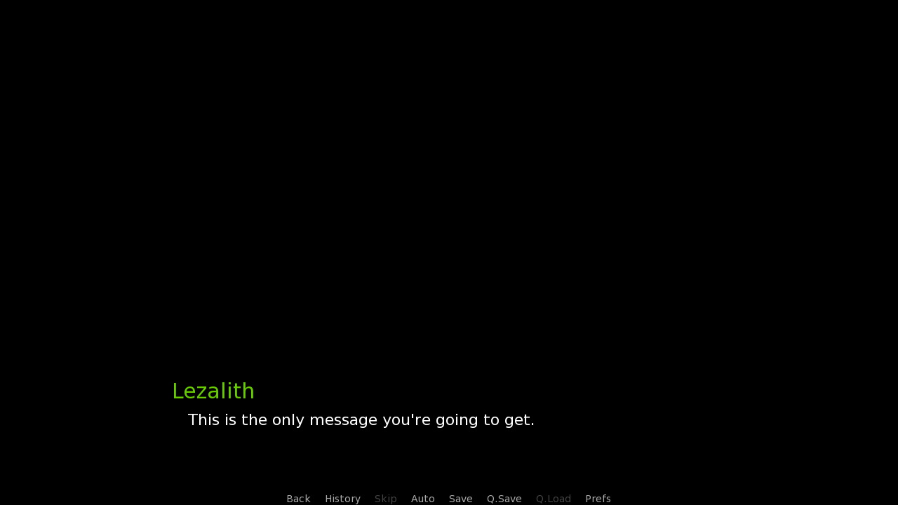
Finally, the fourth screen action that I'd like to show you is SetVariable. This example also shows us that one button can use multiple screen actions.
default whatDidYouClick = "You clicked nothing."
screen ourScreen():
hbox:
align (0.5, 0.5)
spacing 150
textbutton "The Left Button!":
action SetVariable("whatDidYouClick", "You clicked The Left Button!"), Call("ourLabel")
textbutton "The Right Button!":
action SetVariable("whatDidYouClick", "You clicked The Right Button!"), Call("ourLabel")
label ourLabel():
"Lezalith" "[whatDidYouClick]"
returnThis screen utilizes the SetVariable screen action to set a variable to a provided value. In our case, this means changing the whatDidYouClick variable to a message set by the textbutton that we've clicked. Afterwards, ourLabel is called once again with the Call screen action, which has been modified to display the value of whatDidYouClick.
It is important that the SetVariable action is used before the Call one, as screen actions are executed in the given order.
As for the actual screen, it is two textbutton statements inside an hbox in the center of the screen.
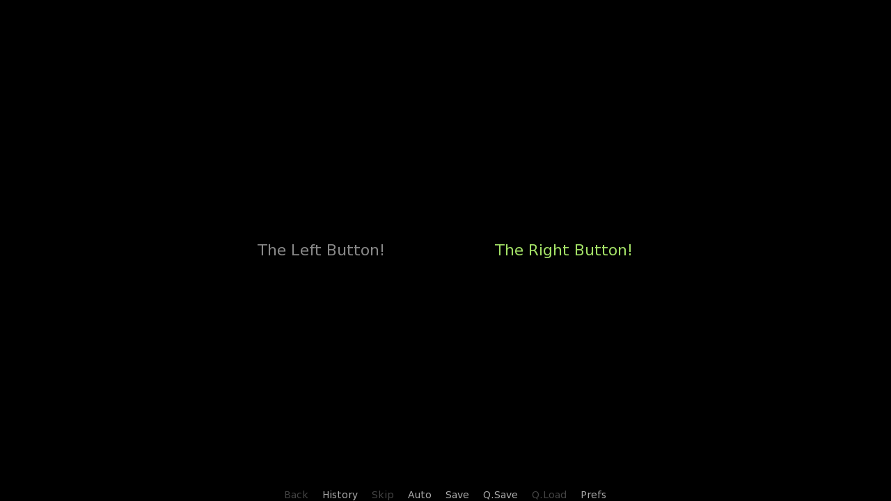
And once we click one of the buttons, the label is called.
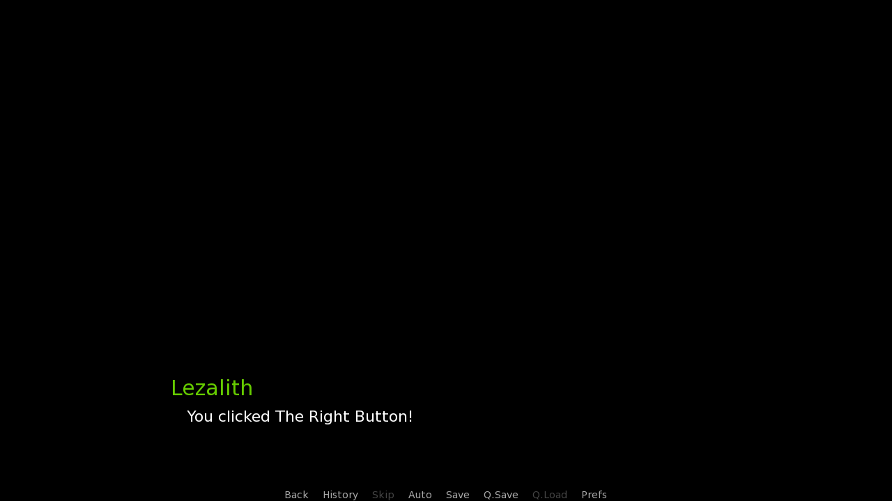
And this is the end of Screen Language #5. What have we learned here?
- Using hovered and unhovered properties on a button
- The mousearea statement
- The Show and Hide screen actions used to show a screen
- The Call screen action used to exit the screen and enter a label.
- That button properties like action or hovered can trigger multiple screen actions at once
- The SetVariable screen action used to set a variable to a value
And this is also the end of the Screen Language #4+5 double tutorial. This has been quite the dose of information, by
far my longest tutorial so far. It is packed and some
of it may be difficult to understand, but I believe in you. Revise, try
out the code blocks yourselves, you'll get the hang of it sooner or later.
It has been a pleasure having you here. As always, thank you for reading my tutorials. I wish you all happy learning! :)